Writers Block
Designing the Jersey City Writers Logo
When the Jersey City Writers group approached me about designing their new logo, their goal was clear: create a visual identity that felt friendly, welcoming, and cohesive across their social media channels—and one that would look just as great on a tote bag as it does on a screen.
I presented three directions, each rooted in local culture and architecture.
Direction One: The Stoop
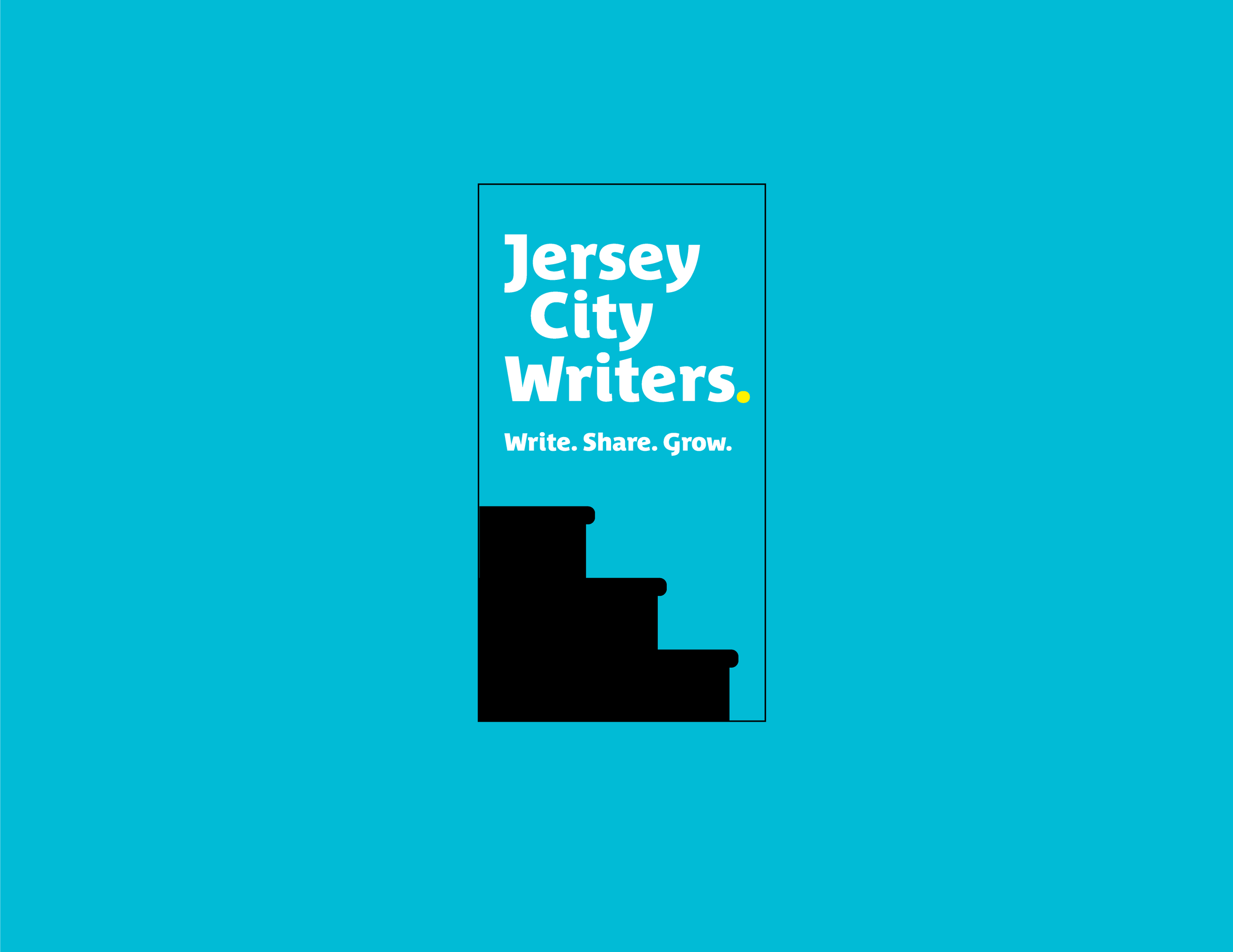
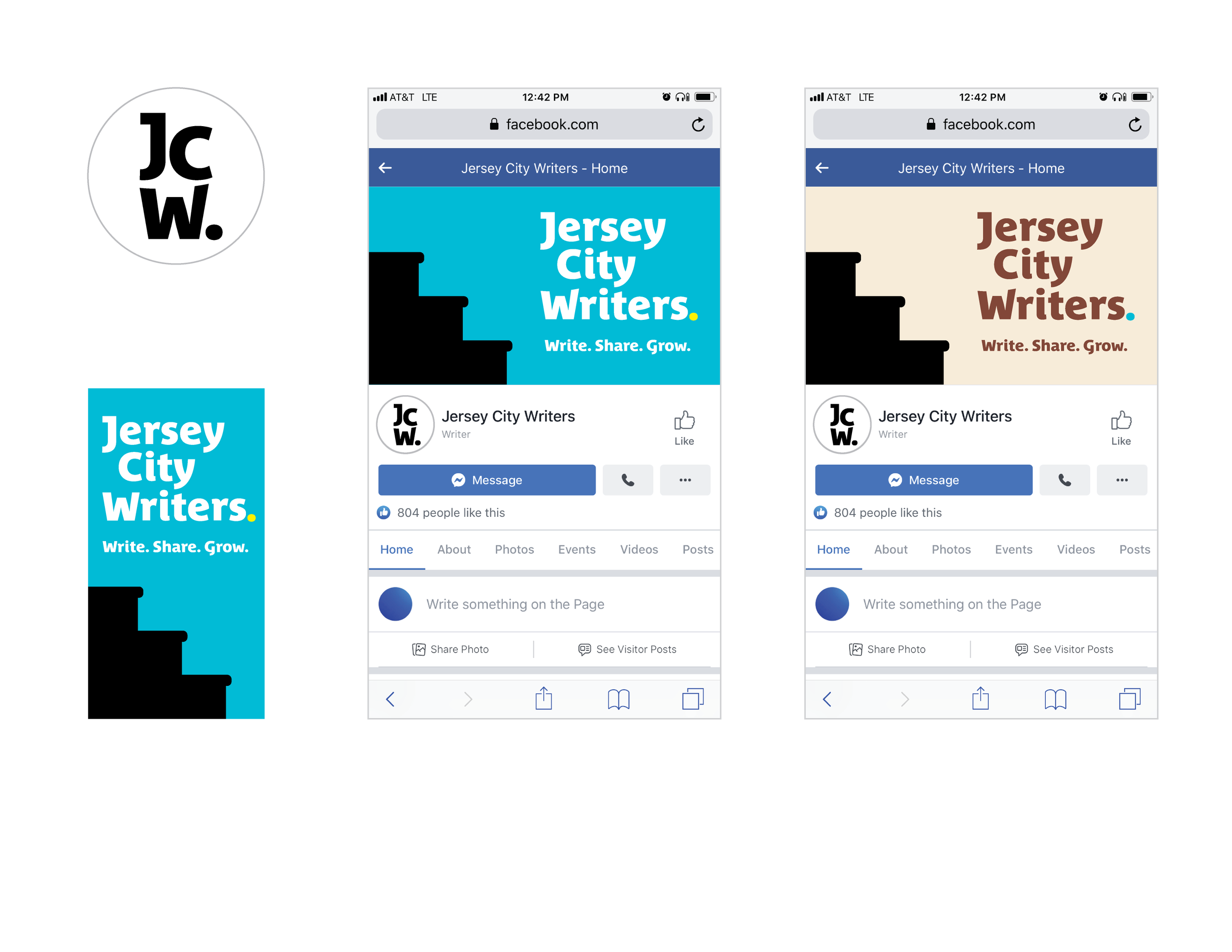
The chosen direction centers around the stoop, a defining feature of Jersey City’s 19th-century row houses. Stoops aren’t just stairs—they’re community spaces. Neighbors gather, conversations spark, and friendships grow on those steps. This sense of connection resonated deeply with the writers, who value collaboration and community just as much as their craft. The three steps represent the group’s motto: Write. Share. Grow. Colorful period punctuation adds visual interest.
Direction Two: The Bowie Mural
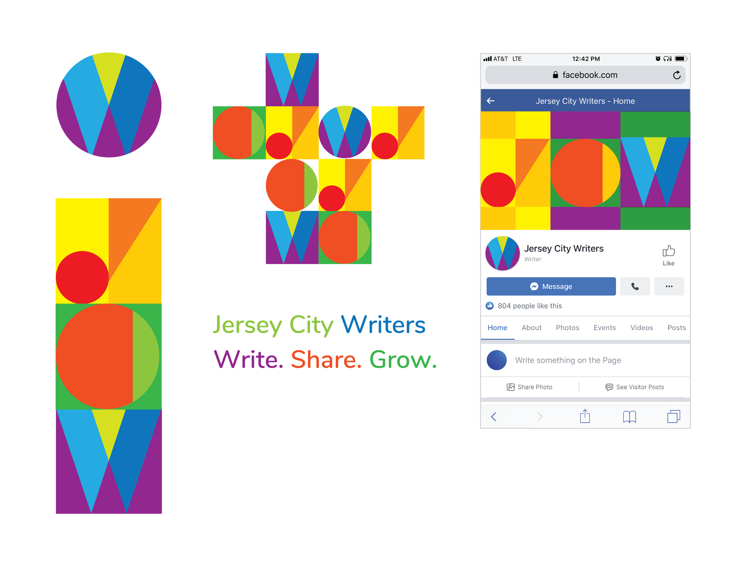
The second concept was inspired both by the colorful, abstract David Bowie mural and by the building blocks of writing itself—the alphabet. Just as every story begins with letters, the design broke writing down to its simplest forms. The JCW letters could be rearranged like alphabet blocks, symbolizing the endless ways writers shape words into stories. Bright, abstract shapes and bold colors mirrored the energy of the Bowie mural—eye-catching, modern, and full of creative possibility.
Direction Three: The Red Oak
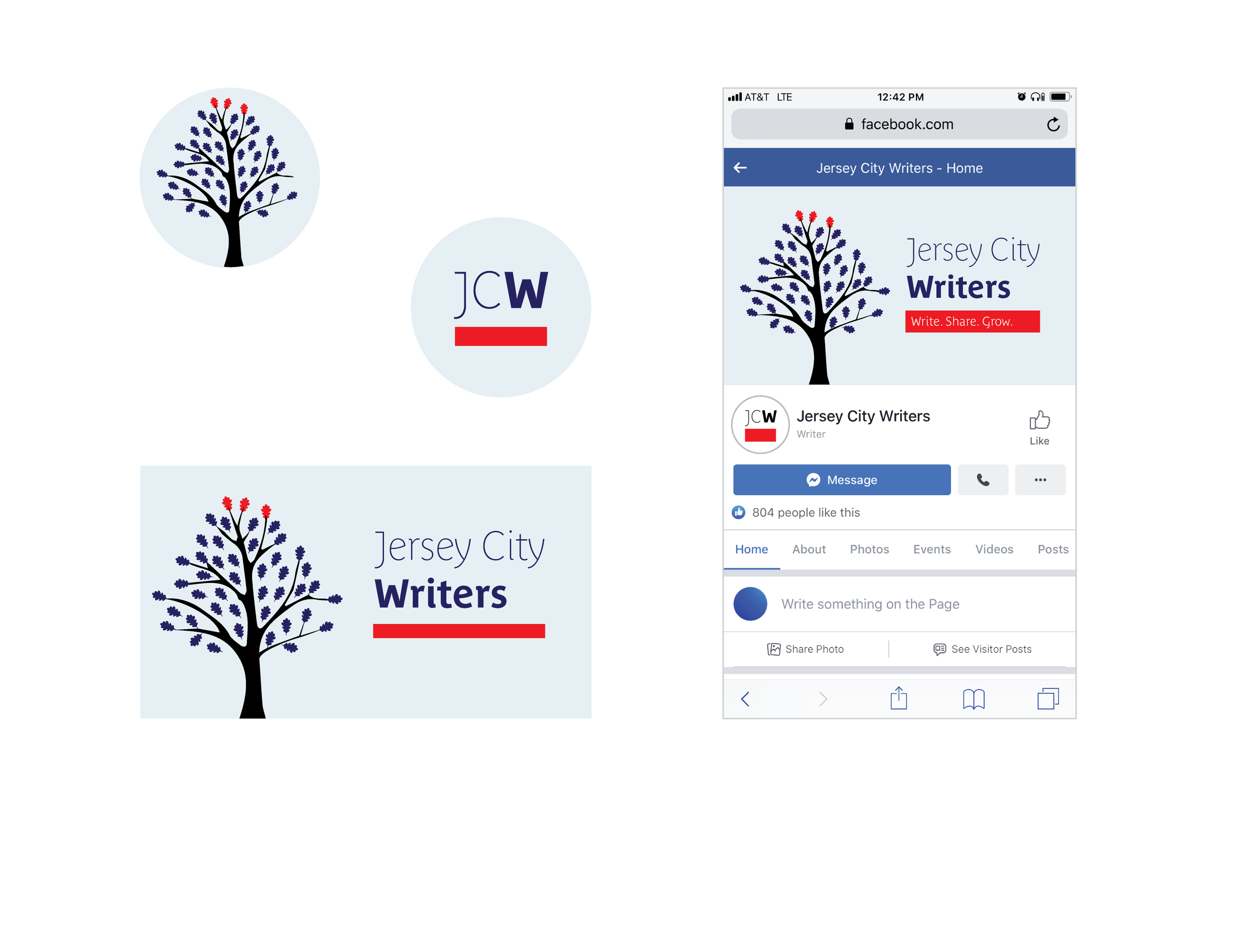
The third option drew inspiration from New Jersey’s state tree, the red oak. The trunk symbolized growth, while the branches and leaves represented the many genres of writing. Three red leaves stood for the group’s motto: Write. Share. Grow. A red line connected the tree symbol to the JCW logotype, tying the system together.
In the end, the stoop design won their hearts. Just like those iconic front steps, Jersey City Writers is a place where people gather, connect, and grow—one story at a time.


