Creative Direction

Client: Root Nine Baking Co.

My role: Creative Director (Consultant)

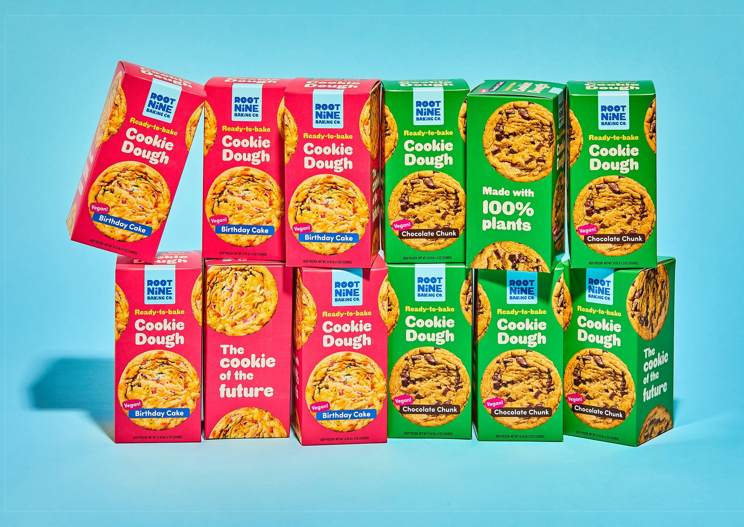
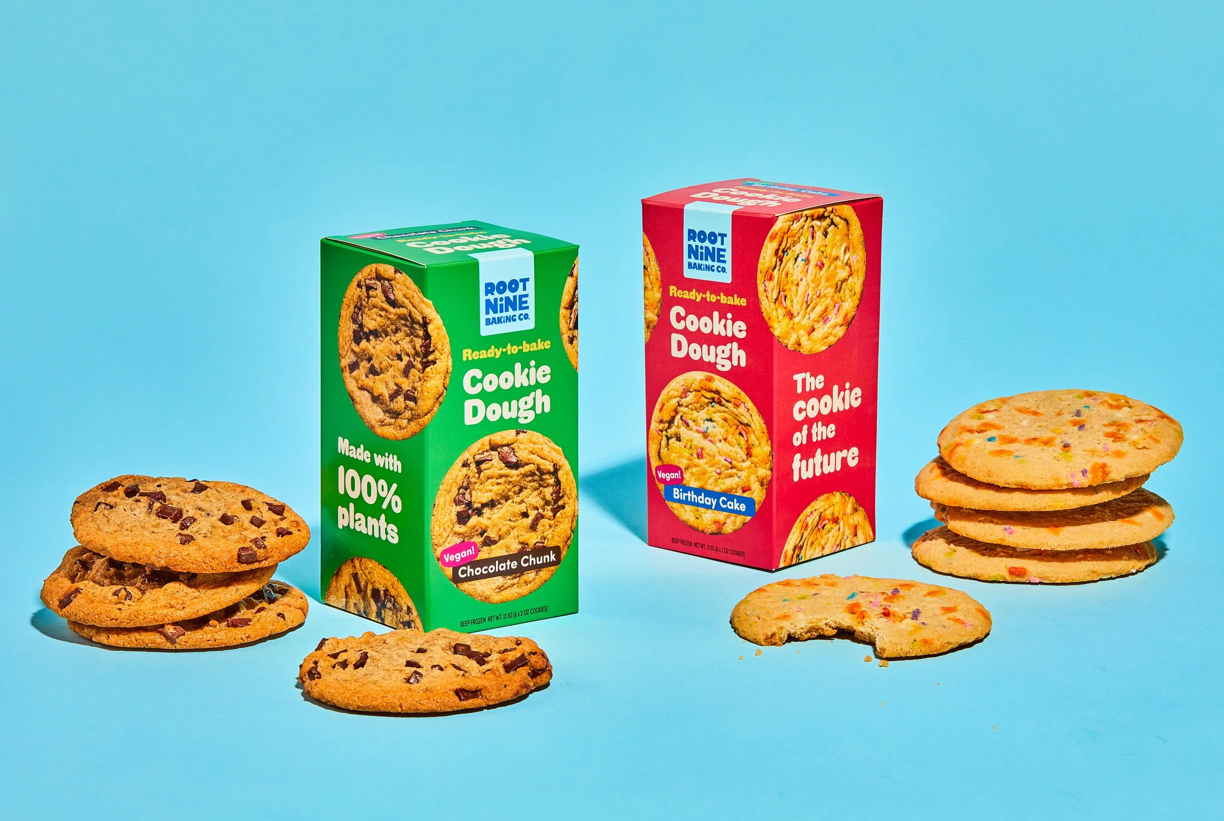
Brief: Root Nine makes delicious cookies that just happen to be vegan. 🍪 Like many fast-growing companies, their brand presence was inconsistent. I worked with them to update their brand identity and retail packaging. ✨

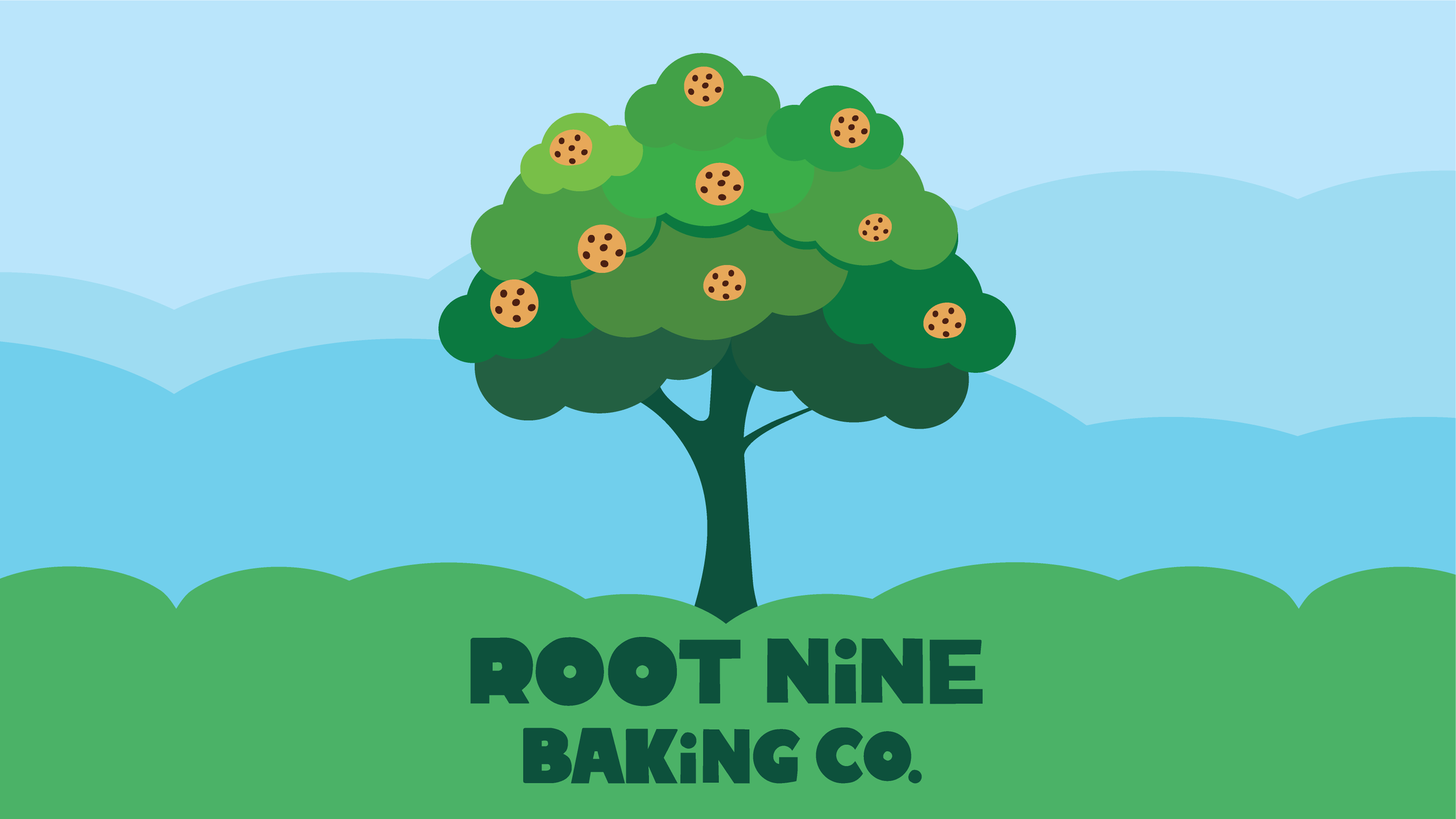
The identity system features a hand-drawn logotype for a quirky, authentic vibe. The cookie tree symbolizes the nine core ingredients that are healthy for people and the planet. 🌱 Bold, bright colors provide a modern edge.
Blue background with the logo for Root Nine Baking Co., with the company name in bold navy blue letters.
Logo for Root Nine Baking Co. featuring a tree with green foliage and cookies as fruit against a background of blue sky and rolling clouds.
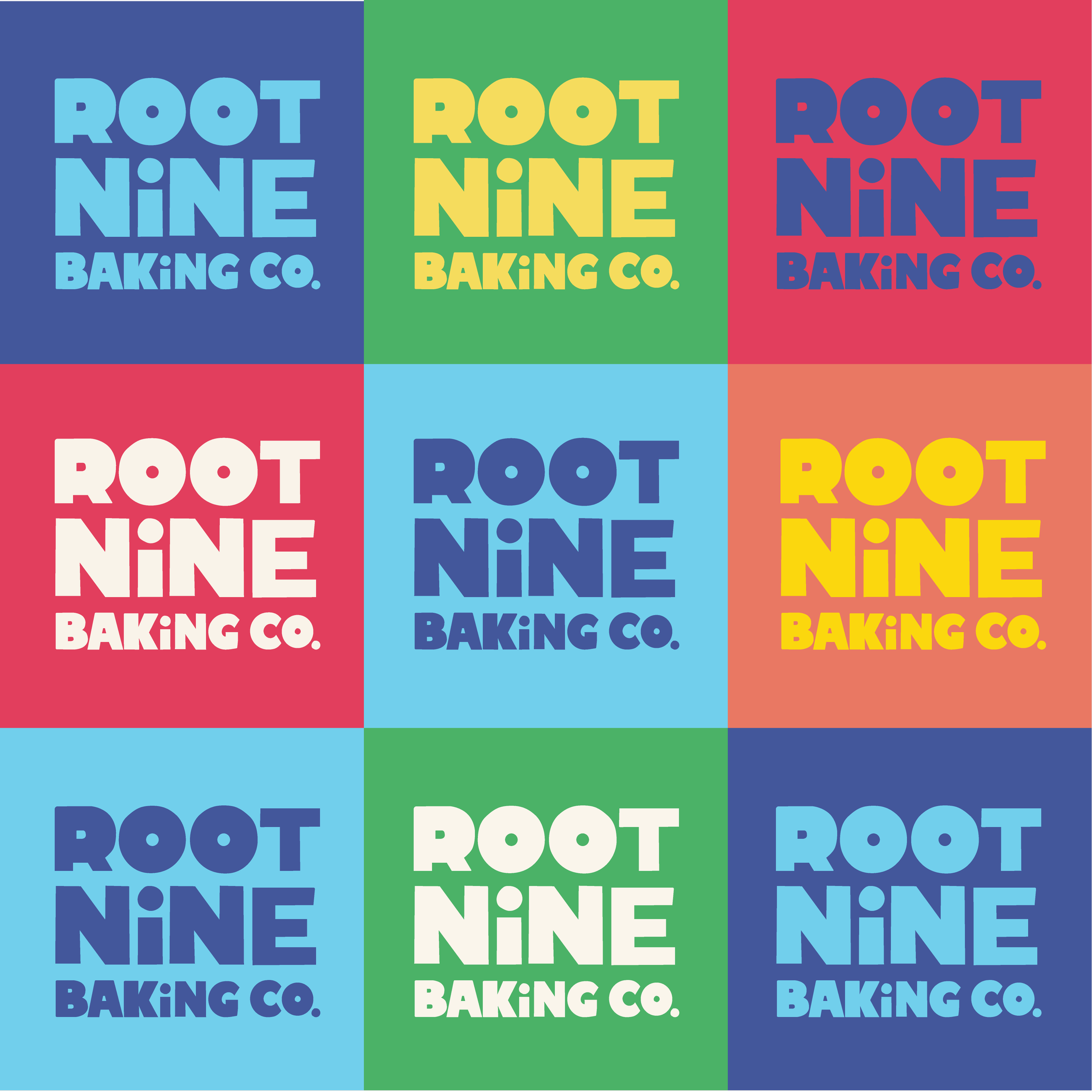
A colorful tiled pattern with nine squares, each displaying the text 'Root Nine Baking Co.' in bold, playful font with varying background and text colors.
A colorful grid with nine sections featuring illustrations of cookies, a sun with a heart, the Earth, a butterfly, the logo for Root Nine Baking Co., a sunflower, a second Earth, a sprouting plant, and a cookie with sprinkles.
Comparison chart showing cookie icons on the left labeled as Chocolate Chip, Birthday Cake, Snickerdoodle, and Double Chocolate, and value icons on the right labeled as Non-GMO with a butterfly, Sustainable with a sun and heart, Clean Ingredients with a sunflower containing a cookie, and Vegan with a plant in soil.
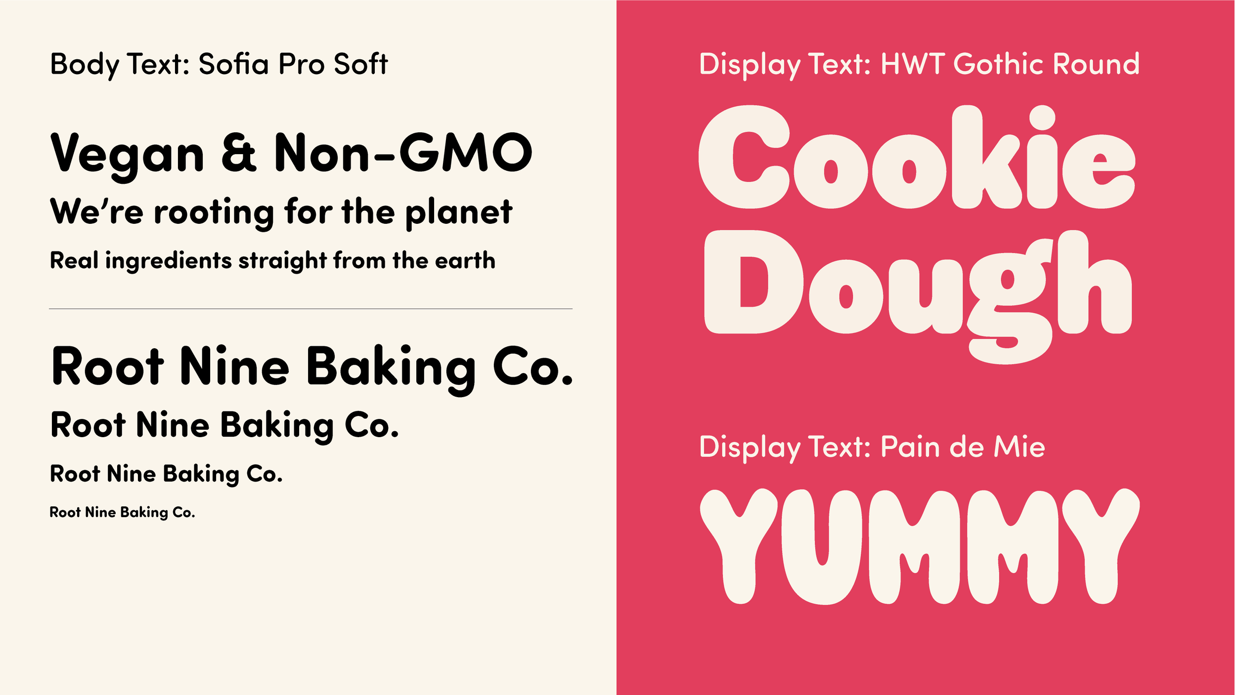
Two different font style samples: on the left, a white background with black, bold, rounded, serif fonts displaying text about vegan and non-GMO products from Root Nine Baking Co., and on the right, a bright pink background with large, playful, rounded sans-serif fonts displaying text about a cookie dough product called "Cookie Dough Yummy".